gm+ad book, Challenging Contextualism, Penny Lewis, Stephen Spear
gm+ad architects – book review
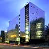
gordon murray + alan dunlop architects, Glasgow, Scotland, UK
gm+ad book
Challenging Contextualism
Penny Lewis, Stephen Spear
£20
Paperback 120 pages (21 Mar, 2003)
Publisher: Gordon Murray & Alan Dunlop Architects (gm+ad architects)
ISBN: 1903653150
Order Challenging Contextualism Today
gm+ad book review by Adrian Welch
31.03.03
A sumptuous hardback cover makes a great start, and its warm autumnal colours carry into the book. Subtle use of the ‘+’ (from gm+ad architects), ingeniously frame photos, reinforcing the idea of creative unison. gm+ad is so much more suitable to the practice direction than the full title still much used: Gordon + Alan should insist on it!
The subtitle ‘Challenging contextualism’ cannot go unnoticed: we see a setting-up of an antithesis to Scotland’s contextual Modernism which Deyan Sudjic recently wrote about and which is popular amongst a large amount of architects with a strong media profile. This is a bold move and suggests from the outset that the book will contain theory, a stance other than simply product profile.
We’re not let down, first by Professor Steven Spier’s introduction, then Penny Lewis’ text, but I want to hear more about the issue of ‘reduced to the maximum‘: this phrase is used to back up the work, and some does resonate with this maxim. However, I would like to know how the bow of Spectrum’s chicken wing and the huge cantilevers of Bewleys and A3 fit with this. They are seen by some as indeed having ‘redundancy in construction or meaning‘ and gm+ad could have used this opportunity to explain their purpose – simply energising the profile or more? They are bold flourishes that draw attention and perhaps should simply be viewed as such.
gm+ad architects’ work is described as being brash: it could also be described as being punk architecture, the SAS (Radisson Hotel) wing for example is subversive to Glasgow’s grid, to the regular underpinning of the city both metaphorically and physically. Opinions will diverge on whether the buildings excite or annoy but all must see that they energise our cities and profession. Similarly, the mention of negagement – ‘writing letters‘ – is important: Scottish architecture can be terribly somnabulant and conservative.
The reference to breaking the grid coupled with ‘waning interest in historical or urban context‘ implies a defying of what-is-expected, not for anti-historical reasons but for sheer practicality, examples being given such as orientation. The partners are not ‘joined at the hip’ so some level of divergence in dealing with various contexts should be expected.
I sense a snowballing of enthusiasm: contrast even the not-so-old – A3’s slate wing is greyish, almost subtle and literally grounded – and the new – Radisson Blu Hotel Glasgow‘s copper wing is of vibrant hue, angled in four planes, massively punctured, irreverent to the city grid and floats agilely. Both wings are devices and both create new language which I have no doubt will be quoted by the next generation of Scottish architects if not before. The growing confidence must surely also be in part due to better Clients and with greater opportunities.
The rippling facade of Bewleys Hotel Glasgow exudes energy from every protrudance, controversial in Scotland maybe, but when compared with a similar rippling facade – Gunther Dominig’s bank in Graz – it’s a mere pussycat. The ‘interference’ in an already semi-corrupted Bath Street is a valid point of debate, but thank God someone is defining an agenda that really stretches the range of what is possible and permissible in Scottish architecture.
A recurring theme of gm+ad’s work is this idea of lightweight envelopes sliding between solid planes, and of wafer-thin foils that are dependent on proficient detailing. The wings of SAS or Bewleys wouldn’t work if they were thicker or edged in a clumsy way. Beyond the blunt shock is a subtle rhythm and counterpoint – Bewleys’ lower and upper canopies form cohesive ‘start’ and ‘end’ to the staccato ‘body’. Having stayed at Bewleys it is indeed sad that gm+ad didn’t get to work the interior as they wished and this doesn’t help the impression of some that the architecture is too showy and externally weighted.
Spectrum similarly has a rhythm in the pillowed, highly-polished stainless steel, random square apertures to the stair core’s north elevation and varying bold colours behind the stridently regular grid of louvres. All combine to create poetry of reflected weather, and, with the polished solid black granite base, reflected city – cars, lights, you, me. Apart from these rather abstract and painterly qualities, the less talked about facades are very clean: witness Spectrum’s smooth south facade and the lack of weep holes, fans, overflows and the like in SAS’ pristine internal facades.
Gordon and Alan’s practice biography joins Richard Murphy Architects’ and Terry Farrell & Partners’: all of a sudden we have architects’ practices in Scotland explaining their process and product in a sophisticated way. This reflects a confidence in Scottish architecture and should encourage more to do the same. The fact that the likes of Jonathan Glancey have made it up to Glasgow to review the SAS suggest gm+ad’s work has reached new levels of maturity: they certainly don’t lack confidence.
Order gm+ad architects book : Challenging Contextulaism
gm+ad architects book : Curious Rationalism 2006
Buchanan Wharf Glasgow Office Development
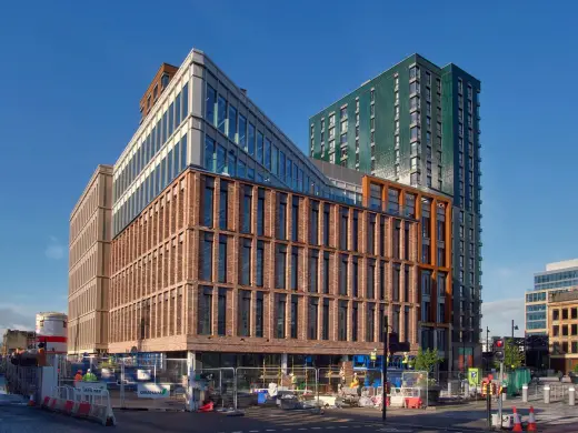
photo courtesy of Drum Property Group
Buchanan Wharf Glasgow Office Development
New Allander Leisure Centre
Design: Holmes Miller
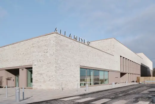
image courtesy of architects practice
Allander Leisure Centre Building in Bearsden
Comments / photos for the gm+ad Book page welcome